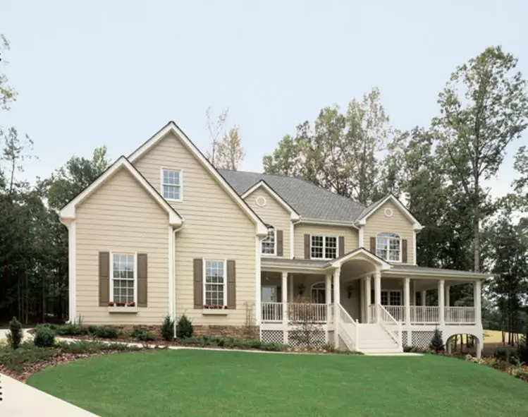
When choosing exterior paint colors for a home with cream or off-white siding, you’ll want colors that coordinate beautifully without clashing. The good news is that cream siding is a versatile neutral that pairs well with a wide range of hues. Here’s a quick overview of the best color options to consider for trim, shutters, doors and other accents.
Page Contents
Warm Neutrals
Cream siding has warm golden undertones, so pairing it with other warm neutrals creates a cohesive, welcoming look. Rich brown shades like chocolate, coffee, taupe and beige are excellent choices. Going a few shades darker than the siding prevents the trim from blending in too much. Darker browns add lovely contrast while still keeping things natural and low-key.
For a really warm, earthy vibe, terracotta, brick red and muted clay-based hues also mix beautifully with cream. These colors pick up the subtle red undertones in cream siding. Just avoid going too bright or orange, which could clash instead of blend.
Try:
- Chocolate brown
- Coffee brown
- Taupe
- Beige
- Terracotta
- Brick red
- Clay
Cool Neutrals
On the cooler side of the spectrum, grays work incredibly well with cream siding. Shades like dove gray, silver gray and heather gray pull out the subtle grays in cream for a sophisticated look. Charcoal gray offers nice contrast as a darker neutral. Just stick to neutral grays rather than ones with purple or blue undertones, which could potentially clash with cream.
Crisp black and white accents also pop beautifully against cream. White siding on an addition or accents like trim, columns and railings helps lighten up the look. And black window frames, doors or shutters add bold definition.
Try:
- Dove gray
- Silver gray
- Heather gray
- Charcoal gray
- Black
- White
Soft Pastels
For a more feminine, romantic look, soft pastel hues like baby blue, pale yellow and lavender pair gorgeously with cream siding. These work well on details like front doors, shutters, window boxes and accent trim. Pastels keep things light and bright. To prevent them from feeling too sweet, balance them out with neutral trim and accents in shades like brown, gray or black.
Try:
- Baby blue
- Butter yellow
- Pale green
- Lavender
Vibrant Accents
Although cream siding is neutral, that doesn’t mean you have to stick to all neutral accent colors. For a splash of vibrancy, brighter hues like cobalt blue, emerald green, brick red and golden yellow also make stylish companions. The key is to use them sparingly, like on a front door, window boxes or a small section of accent siding or trim. This prevents the rich tones from overpowering the cream base. Let the neutral siding do the heavy lifting by keeping it as the dominant color.
Try:
- Cobalt blue
- Emerald green
- Fire engine red
- Sunflower yellow
Avoid Harsh Contrasts
It’s best to steer clear of colors with a drastic contrast to cream like bright whites, jet blacks, neon hues and anything too dark or intense. These jarring shades will compete with the soft cream base instead of complementing it. Stick to complementary versions of cooler grays, warm browns/tans, pastels and vibrant accents instead for flawless coordination.
Avoid:
- Stark white
- Jet black
- Neon colors
- Dark intense hues
Use Natural Materials
In addition to paint colors, natural materials like wood, stone and metal make excellent pairings with cream siding. Warm wood trim and accents pick up on the cream’s golden undertones for a seamless look. Neutral grays and beiges found in natural stone complement cream without much contrast. Metals like bronze, copper and nickel also blend beautifully. Incorporate these materials strategically for added dimension, texture and visual interest.
Try:
- Wood trim
- Timber accents
- Stone veneer
- Metal roofing
- Copper gutters
- Bronze light fixtures
Landscaping Considerations
Don’t forget about landscaping when coordinating with cream siding. Plantings, hardscaping and other exterior elements impact the overall scheme. Neutral foundation plantings are ideal, like:
- Boxwood shrubs
- Lamb’s ear
- Russian sage
- Ornamental grasses
For pops of color in beds and pots, opt for softer pastel flowers like:
- Lavender
- Pink roses
- Yellow daffodils
- Baby blue hydrangeas
And incorporate natural stone or timber elements for hardscaping:
- Sandstone pavers
- Bluestone walkways
- Flagstone patios
- Cedar garden beds
Tying the outdoor areas together with the home’s color scheme is key for a polished, cohesive look.
Creative Color Combinations
Now that you know the general color categories and specific hues that complement cream best, get creative mixing and matching for your own custom combo!
Here are some eye-catching color schemes to inspire you:
Scheme 1:
- Cream siding
- Chocolate brown trim and accents
- Heather gray roof
- Emerald green front door
Scheme 2:
- Cream siding
- White trim and railings
- Charcoal roof
- Brick red front door and window boxes
Scheme 3:
- Cream siding
- Golden yellow window trim
- Black shutters
- Navy blue front door
Scheme 4:
- Cream siding
- Brownstone accents
- Lavender front door and flower boxes
Scheme 5:
- Cream siding
- Dove gray trim and columns
- Brick red Dutch door
The options are endless! Have fun playing with different color combinations and placements to find your favorite cream siding scheme.
Conclusion
Cream or off-white siding serves as a gorgeous, versatile foundation for any home exterior. Pairing it thoughtfully with colors and materials that complement its warm, neutral tone is key. Cool grays, warm browns, pastels, vibrant accents and natural textures make excellent choices. Avoid colors with too much contrast. With the right color palette, you can create a seamless, stylish look that enhances your home’s curb appeal.